Tome 101
How to Create a Great Presentation
with AI in Tome
None of us wants to waste time and all of us wish we had more of it. Especially when it comes to work and making compelling presentations. Building clear, concise narratives in this once-traditional format is easier, visually elegant and efficient in Tome. You might be thinking—Heard. Now prove it.
Tome’s intelligent digital canvas, including our growing template gallery, gives you new and limitless ways to express your thoughts. Already have your topic in mind but want to explore it even further? Or you’re starting from scratch and need thought-starter inspiration to get the presentation going?
Here are three ways to get started making compelling presentations in Tome, along with some of our top design tips to give your presentation polish and impact.
1. Experiment with Create a presentation about…
If your ideas feel amorphous and not crystallized, that’s okay. When you don’t know where to start, using Tome’s AI to create a presentation gives you ample opportunity for refining your ideas beginning with the outline. Say you’re a founder kicking off your first winter footwear collection and need ideas on how to pitch your debut product line for your presentation. Here’s how it works.
- Type your prompt into the command bar at the bottom of your workspace.
- Consider including these structural elements in your prompt—Topic + Goal + Format Type + Specific Content. You'll get better results with Tome's AI when you are specific and precise.
- Let's give this one a spin: Create a 13-page product sales pitch deck about technologically innovative winter footwear and include photorealistic product images. Hit return and Tome's AI will generate an outline in seconds.
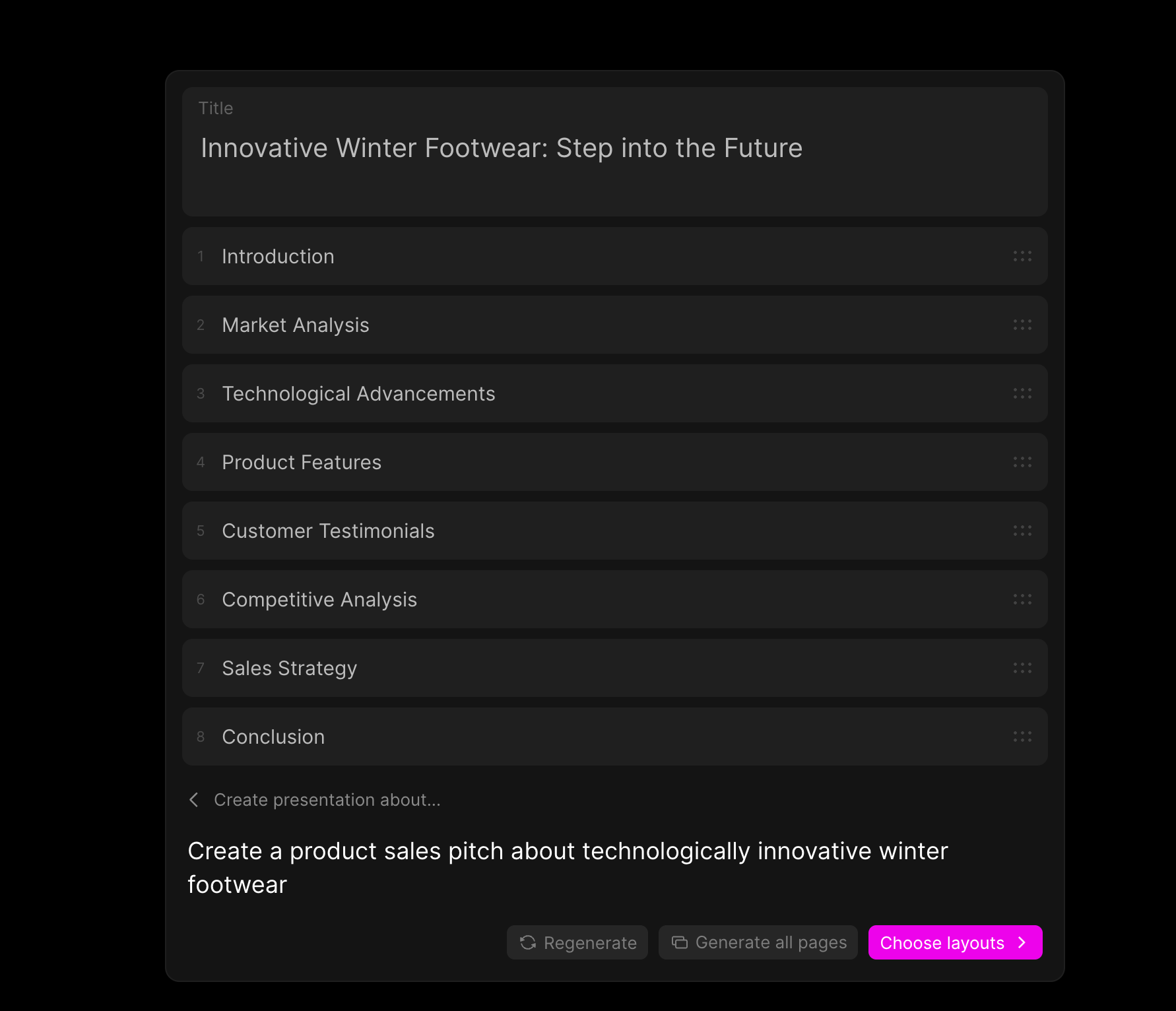
- From here, refine using the outline editor where you can manually customize sections, topics and re-order to get your product line pitch perfect. Just drag and drop with your cursor.
- Click the Generate all pages button to get the full presentation created in seconds. You can customize and re-organize pages manually by dragging and dropping. If you want to start fresh, simply tap the Regenerate button for more presentation options.
- Seeking more page control and layout options? You can direct individual pages' design and your presentation's information architecture with the magenta Choose layouts button.
- Need page-level insights and security? With engagement analytics—available with a Tome Pro subscription—you not only have visibility into who's viewing your work, how deeply they're engaging, you also know how long viewers spend on each page. New tomes you create are also private by default.
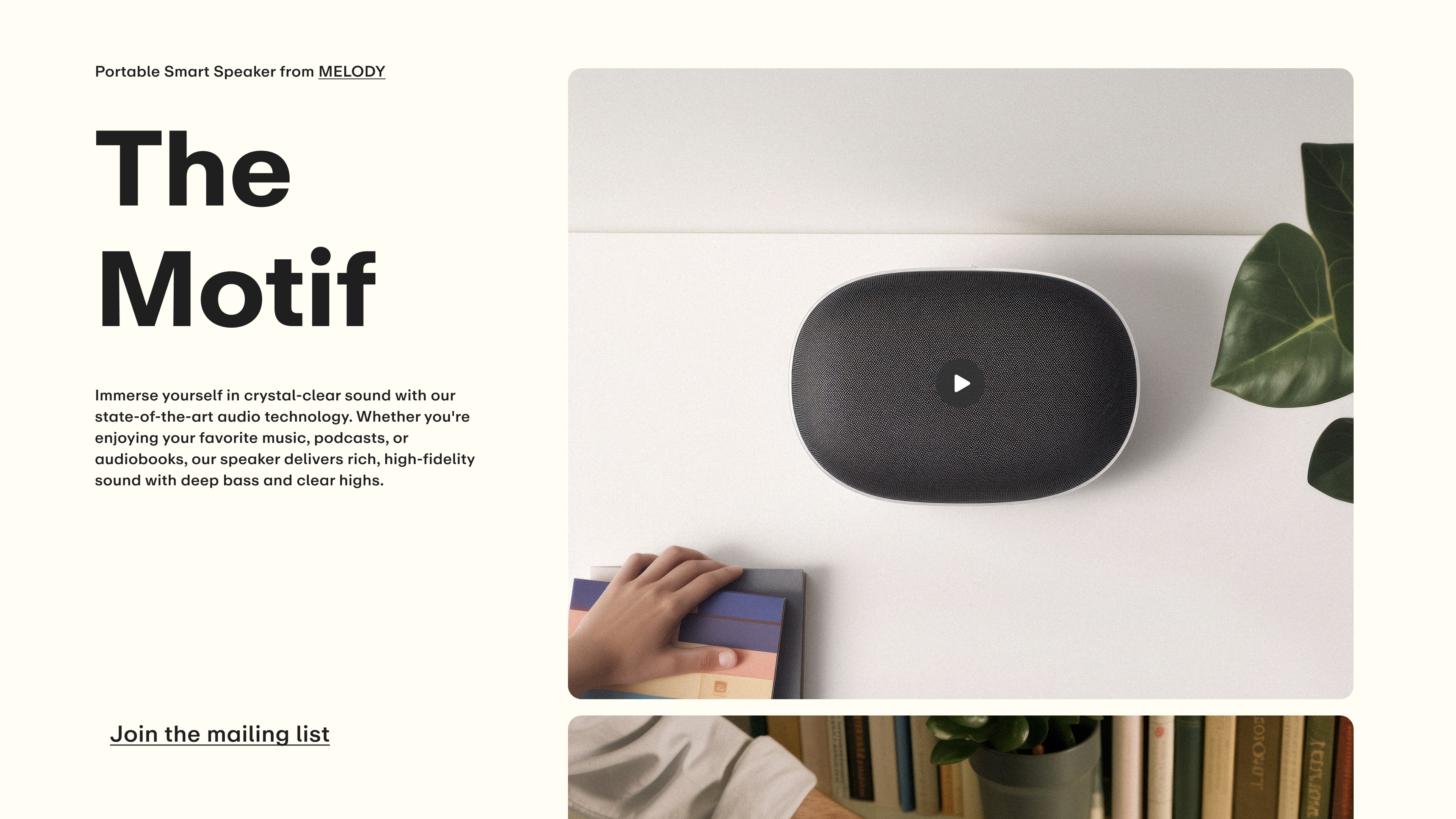
Get to great work faster using Tome's AI. Just enter a prompt and go.
2. Explore further with Create page about…
Leveraging page generation is best for when you have a crystal clear sense of your presentation’s subject but could use additional information and contextual background. Or you’re seeking to go deeper into specific topics that support your presentation’s main point. Here’s how to give this AI tool a whirl.
- Log in to Tome and click Create in the upper right of your screen. At the bottom of your workspace, click into the empty command bar and select Create page about… to get started.
- Type a prompt into the command bar, go broad or get specific. Hit return or tap the Generate button. You’ll get four pages with different layout options to choose from, each with a different approach to your presentation topic.
- Web images is the default choice when you're in Create page about... mode in Tome. Real-world photography from the web is now possible for your use in pages. Tap the Retry button for fresh choices or click the ✓ Keep if you're good to go.
- By default, AI-generated images are now less cartoonish and more consistent in visual style across all pages. You can also ask for "colorful, abstract images," "pencil sketches," "watercolor style images," and more in your prompts.
Don’t worry about losing pages as you go either. Search your AI page generation history by tapping the Clock icon in the command bar to see the last five page prompts you wrote.
You can also take any of the pages you’ve received from previous prompts and add them to your presentation as you build on your narrative. Play and see what happens.
3. Customize with the toolbar
It's key to think of Tome's AI as your teammate and a thought-partner. As you’ve discovered, shaping and getting starter ideas for your presentation using prompts is seamless and fast, but that's only the beginning.
In order to build the proper foundation, narrative and final touches, manually editing and refining is still very much a part of the Tome creation process. Customizing those key elements in your presentation—text, images, layouts and more… it starts with the toolbar. Let’s take a tour.
To the right of your workspace, the toolbar has unique buttons for every type of content you can use in Tome—text, media, (images and video are now grouped together), shapes, tables, charts and interactive embeds.
Think of the toolbar as a remote control for your tome. We'll quickly break down each button for you.

- The first button in your toolbar is the Add text button. Click and you get four tiles for adding in text formats—headlines, body text, list, and captions. Click or drag to add any of these tiles directly into your tome.
- Each of these tiles also gives you additional customization abilities such as choosing colors, changing font sizes and typefaces, using bullets or numbers in list view, etc. Explore and experiment.
- Tapping on the Add media button gives you the options to get AI-generated visuals, upload your own image, or search the web for the right pictures to communicate your point.
- The Drawing button lets you think in shapes, arrows and text for custom drawings. Tap this tile type and easily resize, add visual thoughts, make infographics and more.
- The handy Add table button does exactly that—clicking gives you the ability to quickly add a table. Choose up to six columns across and start organizing your thoughts with visual panache.
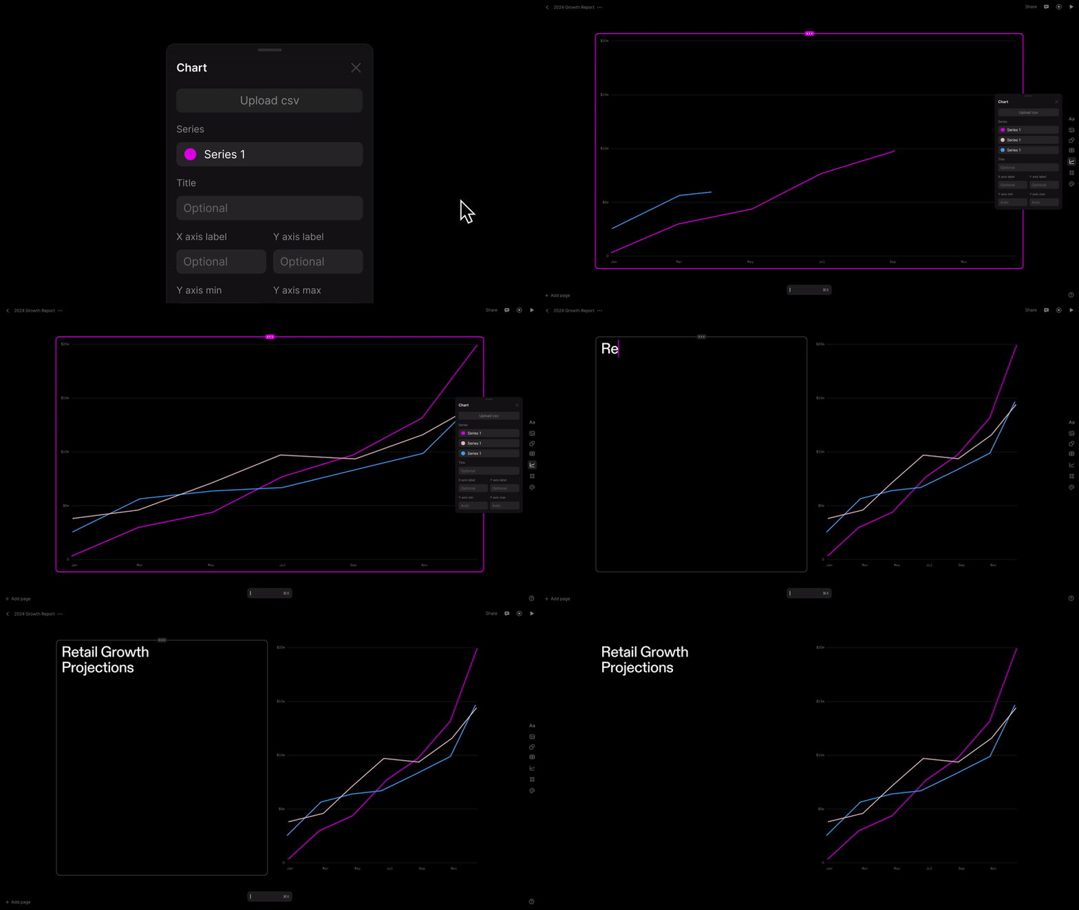
- Data and diagrams—the dynamic duo of compelling business communications in the form of line graphs and vertical bar graphs for charts. Upload your own data from a .csv and get to building with metrics;
- Use the "Type" dropdown to switch between different chart types, and "Edit data" to edit directly without uploading a .csv.
- Clicking the More tiles button is where you can embed website pages and integration tiles like Figma, Airtable and Miro into your workspace to help you add depth and context.
- The palette button lets you customize the look/feel and color of your presentation. There is a robust menu of visual themes to choose from that you can experiment with. Apply to your entire tome or just to specific pages. You can also create and save your own custom theme if you have company branding to adhere to.
- Last but not least, the Record narration button (look for the Record icon at the top of your workspace) provides a bite-sized video of yourself that appears on the page of your tome so you can talk through your presentation points.
- Nobody likes having to parse an eye-chart of too much content on a page. The Record narration feature solves for this.
Editing & formatting options are now connected to individual tiles. Click […] at the top of any tile to make changes, whether you want to regenerate an AI image or reformat text. You can also click and drag […] to move a tile around.
Hint: For a behind-the-scenes deep dive on color and custom themes, check out our tome from the Product Design team.
Tome designers share pro tips
So now you know how to ideate, create and customize your tomes, let’s dive even deeper into design. Since Tome is an inherently visual and totally new way to shape ideas and tell stories, we tapped our team of designers for their advice on how best to polish your tomes, and create impactful work that resonates with an audience.
Text
- Write text by either clicking directly into your workspace, or remember to use the tile selector by tapping on the + icon on the right side of your screen. Drag the Text tile from the tile selector, drop it into your page, and start writing.
- Keep your words on the shorter side when you can. Concise, punchy headlines that convey a single point, followed by smaller supporting text (sub headlines) work best.
- Don’t go too big. It can be temping to use large-sized fonts and typefaces for all of your words, but that can sometimes overwhelm and even confuse your reader.
- Try using headers as page titles. Consider using them as large blocks for testimonial quotes or statements you'd like to emphasize.
- Longer paragraphs can make it more difficult for readers to follow your content. Try to avoid paragraphs that run the entire width of the page.
Color
- Remember to click the palette icon in the tile selector to access the ability to customize colors and themes for either your entire tome, or select pages within your tome.
- Similar to choosing paint color for an interior space, neutrals are best for the background of your presentations. This allows your content to shine on its own.
- If you’d like to integrate more color, consider applying some as an accent in the text color or incorporate imagery, such as photography, illustration, or an AI-generated image.
Page design
- Try dragging and dropping individual text tiles separately onto your page, instead of using a single tile to write all your copy. This gives you more layout flexibility.
- Experiment with aligning multiple text tiles horizontally for additional layout versatility.
- You can manually adjust the height and width of text or media tiles by placing your cursor along the borders to resize. When using a Table tile, keep columns to about 40 max for readability.
- Ensure all bullet points or line items are similar in length, so it looks and feels consistent.
- What do you think... did we follow our own advice? 😉
We hope you bookmark the Tome blog for more productivity tips and product feature overviews like this one. For more spotlights on interesting people making new things with Tome, check out our Success Spotlight stories.
As always, we love hearing from you. Drop us a line at team@tome.app.
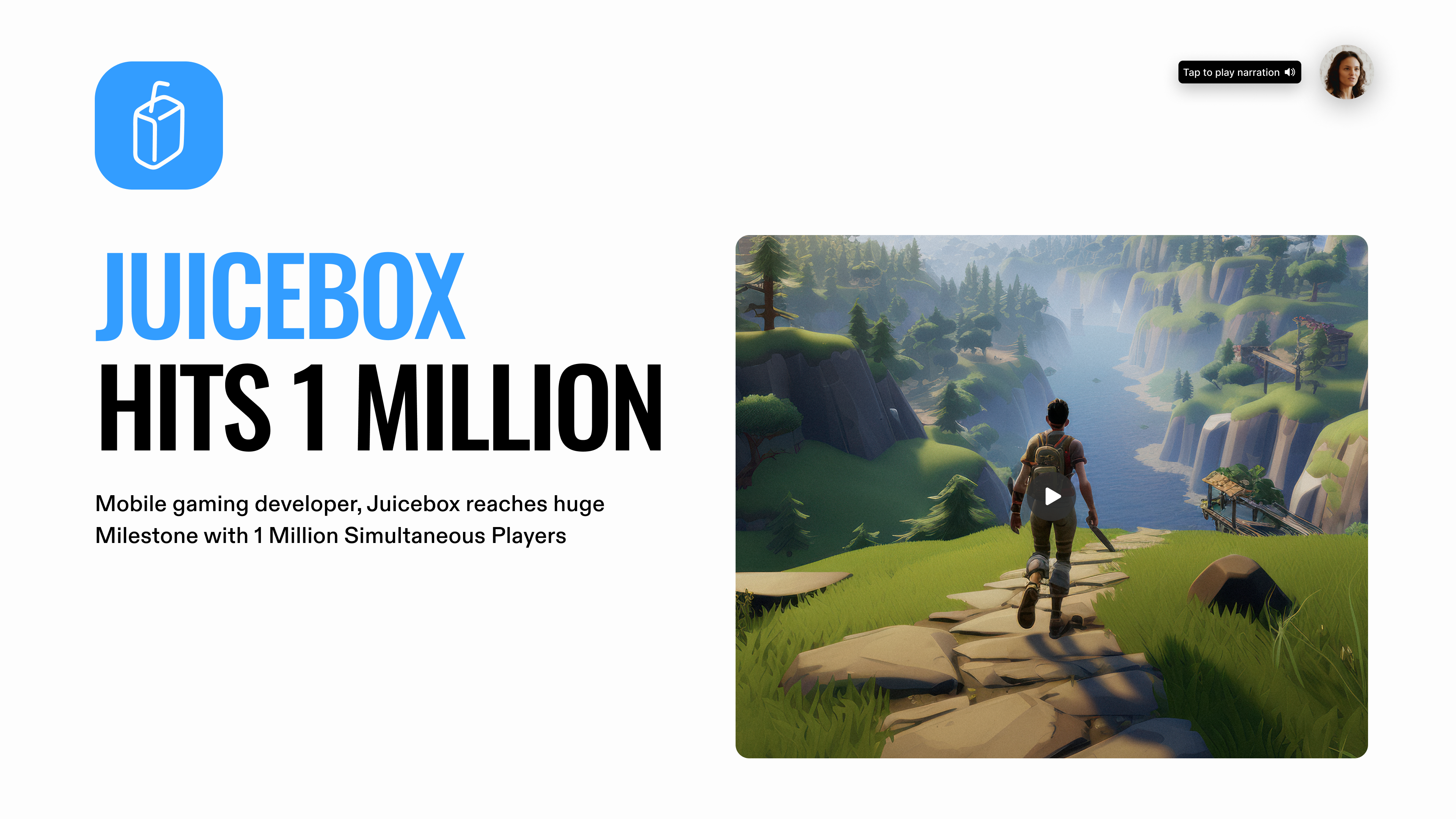
Don't make decks, make progress. Create a presentation in seconds using Tome's AI.
You may also like...
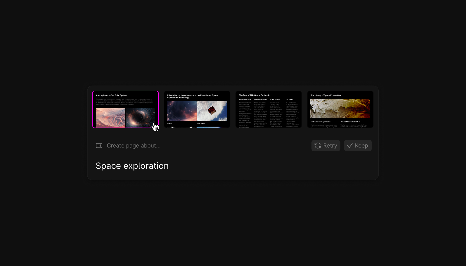
Tome shares best practices and tips on writing prompts for page generation.
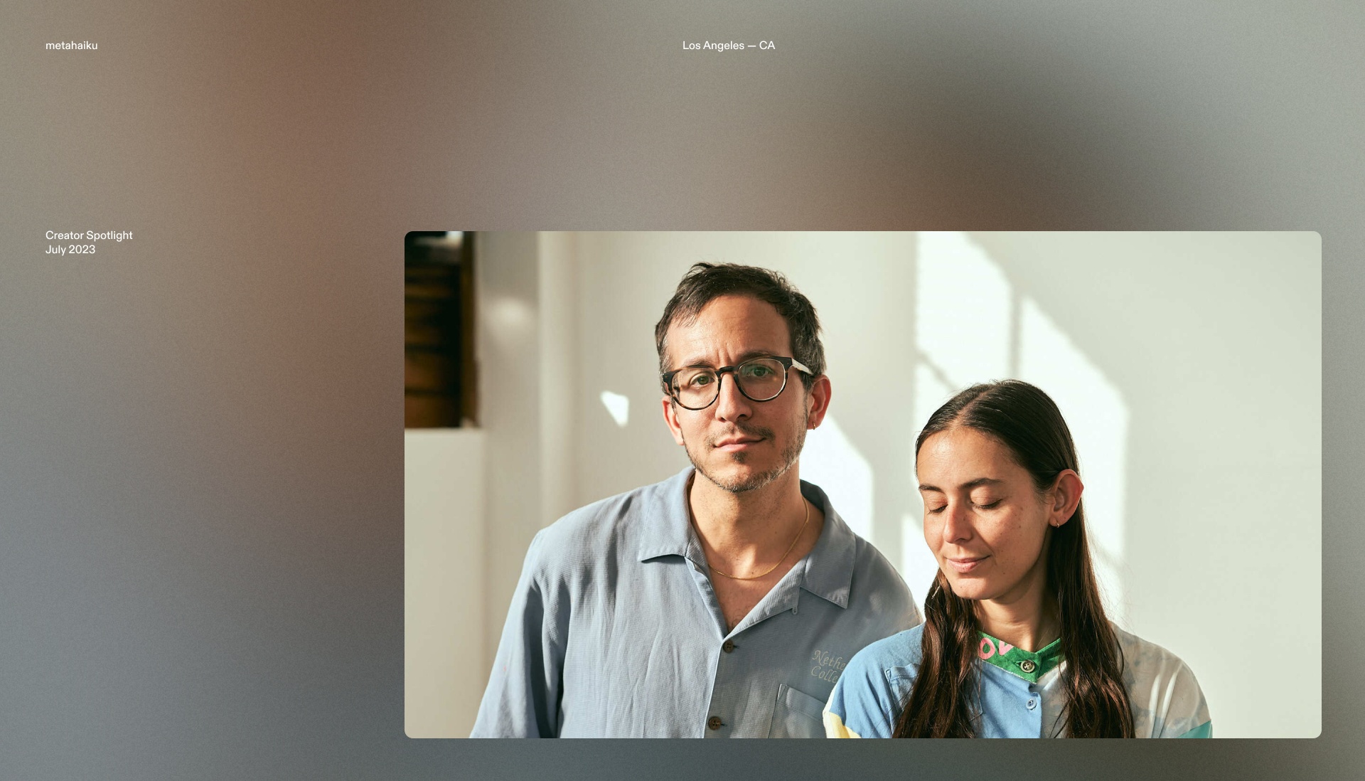
Learn how the founders of a creative studio focused on sustainability get inspired and kickstart their projects with Tome.